There's been a wave of AI design MCP tools lately and I wanted to get my feet wet. I have a journaling app called Book of Life that works fine but looks like a developer built it — because I did. Dark mode, flat cards, colored pills. Functional but cold.
I wanted to see if AI could make it look better.
Google Stitch — round 1
I started with Google Stitch. I wrote a long, detailed prompt describing every screen — journal feed, knowledge graph, insights page, profile, onboarding, AI chat. I took screenshots of my current app using Playwright MCP and uploaded 5 stitched images as reference.
The first output was... "The Celestial Journal." Stitch decided my simple journaling app should look like a fantasy RPG. Cursive fonts, an AI assistant called "Oracle," personality archetypes like "The Existential Explorer," and landscape images for an "Emotional Weather" visualization. My app doesn't even support images.
It also added a hamburger menu to every screen. The app uses a bottom tab bar. There is no sidebar. It added settings gear icons everywhere. There is no settings page. It labeled the Insights screen "Journal." It invented features that don't exist — voice input, camera buttons, file uploads.
Round 2, 3, 4...
I wrote a detailed correction prompt. Remove the hamburger menu. Remove the gear icon. Fix the screen titles. No images. No fantasy theming. The app is called "Book of Life," not "The Digital Sanctuary."
Stitch fixed some things and broke others. The graph showed floating dots with no edges — the whole point of a knowledge graph is the connections between nodes. The AI chat had a sidebar of phantom tools (camera, microphone, image upload, star icon). The profile showed text initials instead of an avatar photo, plus a version number and fake branding at the bottom.
I kept iterating. Each round fixed some issues and introduced new ones.
The MCP angle
One thing that was genuinely cool — Stitch has an MCP server, so I could view and edit screens programmatically from Claude Code. I could list projects, get screen details, and push edit prompts without touching the Stitch UI. That workflow felt powerful. List screens, identify the ones I want to fix, send a detailed correction prompt, all from the terminal.
But the designs just weren't good enough for it to matter.
What Stitch got right
It did invent some features worth stealing. The "Emotional Weather" chart — I already store valence and arousal data on every emotion entity, so a mood sparkline over time is actually a great idea. It also had "Record Answer" buttons on reflection questions, which would let users respond directly from the insights page. And contextual AI suggestions instead of static hardcoded prompts. I added all three to my TODO.
The verdict
I'm disappointed. After multiple rounds of prompt engineering, the Stitch designs were clean but not much different from what I already have. The designs are not attractive. I'm not impressed, even after multiple prompt follow-ups. It kept defaulting to generic dark-mode UI patterns — the same flat cards, the same layout, just slightly rearranged.
The core problem: Stitch doesn't understand what makes a design feel alive. It can place elements on a screen, but it can't create emotional resonance. It can't make you feel something when you open the app. It generates competent wireframes, not designs you fall in love with.
Pencil.dev — actually good
After Stitch, I tried Pencil. The difference was immediate. Pencil has much more beautiful designs.
The workflow was fast and interactive. I could steer the changes I wanted and it could provide meaningful variations of designs. I'd say "show me 4 ways to display insight types" and get 4 distinct options side by side. Pick one, iterate, move on.
Nothing frustrating with Pencil. It worked well with the Cursor extension too — feels like a native Figma. The .pen file updates in real time as you make changes.
The Claude Code + Pencil MCP workflow was great. I could reference files in my codebase and explain what I wanted. Then I could see the Pencil .pen file update in real time:
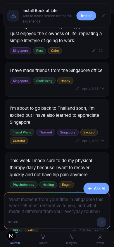
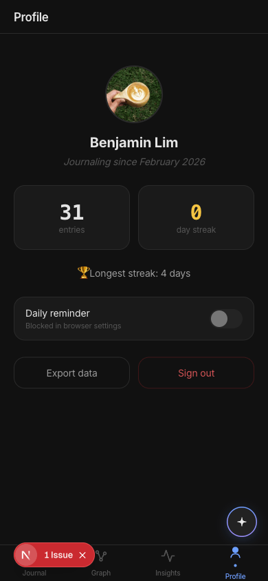
The process went like this: I'd design a screen in Pencil through Claude Code, tell it to view the screen via the MCP integration, critique it, redesign. For each screen I thought carefully about what data we actually have, what belongs on which page, and what doesn't earn its place. A lot of things got removed — mood charts that didn't communicate anything, entity ribbons that duplicated information already visible in each entry, profile stats that were meaningless to users (like "47 entities").
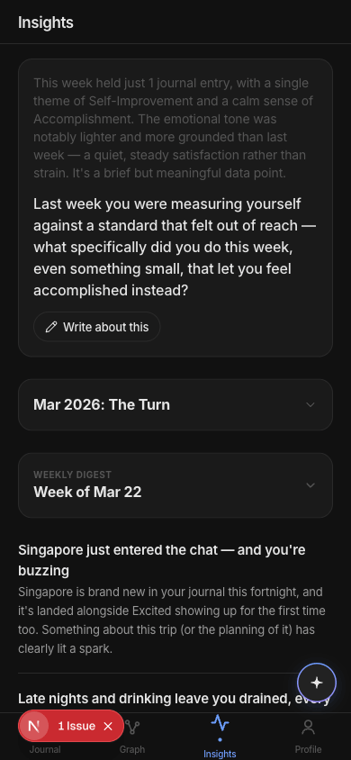
The Insights page got the most work. I restructured it from 3 stacked cards to a reflect-first layout. The weekly digest's reflection question is now the hero at the top with a "Write about this" button that takes you straight to journaling. The story chapter is a tappable row. The AI discoveries are a flat feed with plain-language type labels — "What's new", "People & mood", "Habit & mood", "Gone quiet" — instead of jargon like "trend" and "correlation."
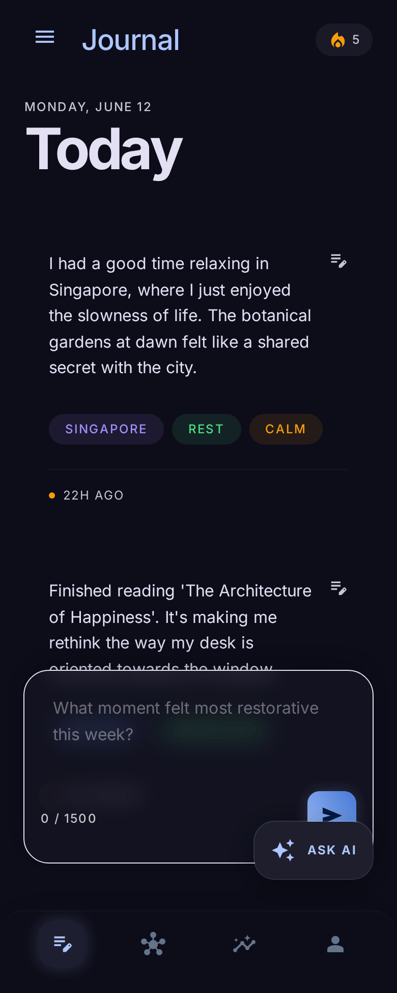
After the designs were done in Pencil, I used Claude Code to implement the whole redesign — 27 files, Pure Dark color palette, new tab bar, new AI button, restructured Insights, cleaner Profile. The designs in Pencil served as the reference and I could keep checking against them.
I'm happy with the end result and I will use it for my new app design.
Stitch vs Pencil
Stitch felt like prompting a chatbot and hoping. Pencil felt like designing with a collaborator. The MCP integration for both tools worked well from Claude Code, but the quality of Pencil's output made it actually useful.
If you're a developer trying to make your app look better, skip Stitch. Use Pencil.